 .
.
SBFAQ Part 6: Color for Text, Sign and Graph Legibility
Marc Green
6.1 Is blue bad?
6.2 Should text be black on white or white on black?
6.3 What colors produce the most readable text?
6.4 How do I use color in graphs and charts?
6.5 Does color affect eyestrain?
6.1 Is blue bad?
Blue gets a lot of bad ink, not to mention a lot of bad pixels. Guidelines often say to avoid
blue for text and other objects with fine detail. Many have adopted this mantra
without question or inquiry. But studies generally find blue to be an excellent color for
text and foregrounds in CRT displays. What causes this discrepancy?
Blue is supposedly bad for two reasons:
- chromatic aberration: white light entering into a prism or other lens refracts, i.e.,
bends. The amount of refraction depends on wavelength. Short wavelength light, which
usually is perceived as blue, bends more than other wavelengths. (You can see this by noting
that the spectrum created by a prism has red on the top and blue/violet on the bottom.) As
a result, no lens can sharply image all wavelengths at the same distance. The eye’s
lens tends to focus long and middle wavelengths, leaving short wavelength a bit blurred.
In theory, it should be more difficult to see fine detail in blue.
- foveal tritanopia: the fovea has the highest resolution for perceiving fine detail.
There are no short wave cones in the very center, the area of maximum resolution, so
presumably it is impossible to see blue when an image falls there.
These considerations may or may not be important for viewing printed material and other
continuous (or extremely high resolution) media. In computer graphics, however, these
factors are largely irrelevant because computer images don’t have sharp edges. The
digital image consists of pixels which are inherently highly blurred. In fact, a rough
equation would be
total blur = (image blur) + (chromatic aberration) + (accommodative error)
Pixel blur is so great that chromatic aberration’s contribution to the total blur
is small. In contrast, printed images have little intrinsic blur, so chromatic aberration
constitutes a major factor. Moreover, the best brightness contrast possible on CRT screens
is far lower than that of normal print. This makes sharp detail in computer screens even more
difficult to see. So the negative effects of blue in print (if there really are any) do not
transfer to the computer screen. (And no, resolution doesn’t matter. Pixel blur is
still noticeable even on 2K by 2K monitors.)
In addition, the visual system seems to deblur color edges anyway. The part of the
visual system which processes any color has low resolution. Color should appear to bleed
across edges, but, in fact, this doesn’t happen. The reason is that the achromatic
system "captures" color. That is, the color seems contained within the
achromatic boundary. This is why you only see the inherent blur of color edges when there
is an equiluminous border, which has no brightness contrast - and this happens very
rarely. Moreover, the blue cones contribute very little to brightness perception anyway.
On the other hand, blue is useful to create high luminance contrast. Blue is the next
darkest color to black, so it provides high contrast against light colors to enhance
acuity. This probably explains why so many studies find it to be excellent for text and why viewers
rate blue/white and blue/yellow combinations highly.
(As a note, I suspect that blue's bad reputation is based in part on the lowered acuity
in blue ambient illumination. "Blue light" scatters more and causes
indistinct edges, as in aerial perspective. This is a different matter, however, than
observing blue objects in normal lighting.)
6.2 Should text be black on white or white on black?
Black on white generally produces results which are equal to or better than white on black(e .g., Sanders and Bernecker, 1990; Bernecker, et al., 1994), although the outcome depends on exact circumstances. Factors favoring black on white include:
- The higher mean luminance level produces higher viewer adaptation level which produces better acuity. Reading smallish text depends on fine visual acuity.
- The higher brightness level causes the pupil to shrink, resulting in two beneficial effects. First, it improves retinal image quality by reducing spherical aberration - misfocus due to small refractive errors in the lens and cornea. Second, as all photographers know, the smaller light aperture increases depth-of-field. This means that the print stays in focus over a greater range of viewing distances. (This can greatly help some people who wear bifocals. The short focal distance is tuned to reading distances, 25 cm, while the longer focal distance is many meters. Computer screens fall right in the middle, so it is difficult to accommodate using either upper or lower bifocal lens.)
- There is much less screen reflection of glare sources with a white background. Try turning the computer off and note that you likely see reflections from other light sources in the room. The white screen washes out and often eliminates reflections. Of course, it is usually possible, and probably desirable, to light the room so that there is minimal glare and reflection from other light sources.
- In offices and other well illuminated environments, there is less change in viewer adaptation level when looking away and then back to the screen.
- Black print on white background is more familiar because it simulates the text presentation in books and newspapers.
- Black objects on white background are slightly more visible than are white objects on a black background.
On the other hand, there are factors favoring white on black:
- If monitor refresh is sufficiently low to produce annoying flicker, then white on black is better. Flicker is less noticeable in small objects (letters) than in large areas (background.) This is why screens in the 30 Hz interlaced days all used white letters on black backgrounds. Since humans can see flicker at rates up to 80-90 Hz, 60 Hz CRT refresh rates can produce flicker.
- When brightness increases, the CRT\92s pixels expand and become more blurred. The blur decreases image sharpness. If the font has thin stroke width, then the expanded pixel width impinges on the dark areas and makes the thin strokes even harder to see.
- If the room is dimly illuminated, then a bright white screen can be a glare source and create eye discomfort. This is especially true for the elderly. The Illuminating Engineering Society Handbook recommends that the luminance ratio between a work area and its surround should not exceed 3:1.
A designer must take all of the factors into account, but the good news is that many studies report that polarity doesn\92t matter much (e.g., Legge et al., 1986). This is probably true when font size is large and highly readable. Any time you are dealing with highly visible objects, secondary issues such as polarity and color are not as critical in determining visibility.
Probably, the optimal background would be a very light, desaturated blue. The light background produces high brightness contrast against dark letters. By toning down the white, the screen is less likely to act as a glare source. Finally, the use of some blue will produce aerial perspective and provide a bit of foreground-background separation.
Font legibility is never the only issue and design almost invariably requires tradeoffs—otherwise every display would be black and white. While you don't always choose optimal combinations, you need to pick reasonable ones and to compensate with increased size.
6.3 What colors produce the most readable text?
Hue and saturation per se are not important for legibility.
Text readability depends on the ease of distinguishing letter and word shapes
which in turn depends on the discrimination of fine detail. High achromatic
contrast maximizes this aspect of perception. Since the chromatic system
has 1/5 the spatial resolution of the achromatic system, color cannot produce
fine detail.
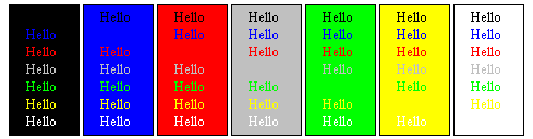
The picture shows examples of various color text on different backgrounds.
Text brightness increases from top to bottom and the background brightness
increases from left to right. The picture portrays a worst-case scenario
because the fonts are small and the backgrounds are highly saturated,
both undesirable visually. However, this provides an acid test for readability
of color combinations.
Colors of similar brightness, don't work well. Combinations such as
red-blue, green-yellow, green-white, green-gray ("button gray",
the Windows standard gray) etc. are poor because even though they have
high chromatic contrast, they have small brightness contrast. The worst
combinations generally involve combinations of green, yellow and white.
At high brightness contrast steps are bigger due to Weber's Law.
The best combinations have the two brightest colors, white and yellow,
contrasted with the two darkest colors, black and blue: black-white, blue-white,
blue-yellow, and black-yellow. Red has a dark intermediate brightness
and works reasonably well against all backgrounds but blue. Black and
white backgrounds offer the most options for text color.
Note how your own eyes contradict the "blue is bad" theory
- blue is a very good color against most backgrounds. The only exception
is red, where there is an odd halo effect. This might be a trace of chromatic
aberration, since red and blue are at opposite ends of the wavelength
spectrum. However, it may be due to the brightnesses being near equiluminance,
which also produces uncomfortable edge effects. To test the idea, the picture
below shows blue on fully saturated red and on a slightly lighter and
less saturated red. The halo is gone on the lighter red, suggesting that
equiluminance is at least part of the problem. In any event, highly
saturated red backgrounds should be avoided.

As with most rules in perception, there are some caveats:
- Everything stated above assumes the use of high saturation colors.
The brightness of a color can always be increased by adding white -
desaturating the color. For example, on my monitor, saturated blue has
a luminance of only 10 cd/m2 while the lightest blue on the Visual Basic
default palette has a luminance of 75 cd/m2 and white is 80 cd/m2.
So white has high luminance contrast with the saturated blue but not
with the desaturated blue. Remember the rule: maximize brightness contrast
between text and background - the light, desaurated blue would work on
a dark background.
- The importance of brightness contrast varies with font size. In general,
the larger the text, the less ability to resolve fine detail matters.
Most of the advice given here and elsewhere is for a worst case scenario:
extended reading (paragraphs, etc.) of small print. When print becomes
bigger and there is only a word or two (labels, etc.) then there is
less need to worry about high brightness contrast. In fact, Legge et al. (1990) found that reading rates for brightness and color contrast were equal with large text. This shows that color contrast can be used in place or in addition to brightness contrast under some conditions. Of course, it is always necessary
to have some brightness contrast in order to avoid the equiluminous
swimming borders. However, the viewer may have control of text size,
so the designer should plan for a worst-case scenario.
- The importance of font legibility and hence color selection is also
a function of the role played by text in the display. For example, text
as field labels doesn't have to be as legible as the data in the field.
Even moderately experienced users quit looking at field labels and pay
attention only to the data, which the users recognize by screen location.
One good standard practice is to make field labels a normal font and to make the data a bold font.
- Legibility is not the only criterion for choosing text color. People
may set text and background colors to meet any number of criteria, including
aesthetic. (I\92ve seen plenty of users set displays to purple text on
a blue background.) If the text is sufficiently large and the user\92s
eyesight is normal, then color is probably not critical for readability
since visual acuity is not being taxed. Otherwise, users are choosing
to create a less efficient display.
There is one last important point about using colored text. If an application requires someone to read for long periods, you might want to consider using a monochrome monitor. It produces sharper images and better readability than a color monitor of the same resolution. Monochrome monitors do not contain the RGB triad at each location, so the pixels are more distinct.
6.4 How do I use color in graphs and charts?
This is a very large topic, but there are a few points that are especially important:
- Use hue to show categorical distinctions. Code categorical variables such as country, individual, etc. with color but not quantitative variables such as amount of money, weight, etc. However, there are exceptions:
- It is sometimes useful to break continuous variables into categories to aid interpretation. A monitoring system might quantize the continuous variable temperature in categories safe (green), caution (yellow) and warning (red) or a system might use color to differentiate positive and negative numbers while using brightness to quantify each class.
- If the user has a control for thresholding, then use hue to quantize continuous variables. For example, if the user is looking at a brain scan, then provide a control for thresholding some cell function (metabolic activity, etc.) to different levels. Make all brain areas above the threshold one hue and all below a different hue.
- If drawing a graph with thin lines or very small data points, remember that the eye does not discriminate colors of small objects very well. Don't expect people to easily discriminate data represented in blue from data represented in black or data represented in yellow from data represented represented in white. Use larger data points and/or more discriminable, high saturation colors for important distinctions.
- If using small data points, employ high brightness contrast. The viewer will have difficulty discriminating the difference between data points, such as small squares and circles, unless there is high achromatic contrast. Remember that the chromatic system has poor spatial resolution, so color contrast won\92t help discriminate small shapes. Similarly, if there are dotted lines, make sure that the dots are discriminable from the background.
- Use standard color meanings if possible. Heat is red, money is green, etc. However, don't rely on color solely and don't assume that the viewer will understand. Back up the color meanings with a legend.
- If the viewer is expected to remember a specific meaning for each color (a different year, person, industry, etc.) from one graph or chart to the next, use no more than 5 colors. Each should be a central category member.
- Use high color contrast and saturation to show emphasis and to draw attention to important information. Conversely, use low contrast to indicate secondary importance.
- Optimize use of preattentive processing. The importance of optimizing preattentive processing and of minimizing thinking has been widely acknowledged in the visualization literature. Cleveland (1984), for example, has noted that in "elementary graphical-perception tasks," the preattentive perception of basic graphical elements underlies data visualization. Abarbanel (1993) suggested that visualization can be defined as the substitution of "preconscious visual competencies"
for "conscious thinking." Woods (1991) further said that
"If the mental activities required to locate base data units are not automatic, but require mental effort or capacity, they may disrupt or divert...the main line of reasoning." The terms, "preattentive," "immediate," "preconscious" and "automatic" all highlight the necessity of designing displays so that the viewer can effortlessly perceive the fundamental visual element and distinctions.
6.5 Does color affect eyestrain?
The short answer is that poor color usage can increase chances of eyestrain. In order to explain why, I must step back and explain the causes of eyestrain.
The major origin of eyestrain is eye muscle fatigue. The eye has two sets of muscles, ciliary and oculomotor, that play a major role in perception. Just like any muscles, the ciliary and oculomotor muscles tire if overworked. When this occurs, eyestrain can result.
The oculomotor muscles around the eye control direction of gaze. When focusing on an image, the oculomotor muscles turn the eyes inward so that they point, or "verge," on the focal object, and its image falls on the fovea in both eyes. If you sit in the dark there is no visual input so the muscles relax to a resting state. Resting vergence is 20-25 feet for most people, although there is wide individual variation. At this distance the muscles are completely relaxed.
If you view a screen which is much nearer (40-60 cm distance is normal for computers), then the vergence muscles must work to turn the eyes toward the nearer point and eventually there is fatigue. The closer the distance, the more the muscles work and the faster they fatigue.
The ciliary muscles change the lens thickness when a viewer accommodates to bring the image into sharp focus. The ciliary muscles' resting state brings objects at about 20 feet in focus, so accommodating to nearer objects causes muscle stress in the ciliary as well as in the oculomotor muscles. A recent study shows that people have huge accommodative error when trying to focus on a CRT screen; they tend to focus somewhere between the screen distance and the resting accommodation. (However, research results suggest the vergence stress is far more important than accommodative stress in causing eyestrain.)
Any factor which causes someone to read at a shorter viewing distance will promote eye muscle fatigue and therefore eyestrain. This is exactly what occurs when legibility is low, as when reading in dim light. The reader brings the material closer to the eyes which effectively increases the font size. Low achromatic contrast also decreases legibility and causes shorter viewing distance.
So the answer to the question of color and eyestrain is this: if the designer chooses colors which produce insufficient achromatic contrast, legibility will be low. The user will move toward the screen to increase font size. The ciliary and oculomotor muscles will work harder and make eyestrain more likely.
Back to Top
- It is sometimes useful to break continuous variables into categories to aid interpretation. A monitoring system might quantize the continuous variable temperature in categories safe (green), caution (yellow) and warning (red) or a system might use color to differentiate positive and negative numbers while using brightness to quantify each class.
- If the user has a control for thresholding, then use hue to quantize continuous variables. For example, if the user is looking at a brain scan, then provide a control for thresholding some cell function (metabolic activity, etc.) to different levels. Make all brain areas above the threshold one hue and all below a different hue.
A division of 2057949 Ontario, Inc.
Copyright © 2024 Marc Green, Ph. D.
Home Page
Contact Us
![]()
![]()
![]()
![]()
![]()
![]()
![]()