 .
.
SBFAQ Part 4: Color Blindness
Marc Green
4.1 How many people are color blind?
4.2 What do color blind people see?
4.3 What colors do the color blind confuse?
4.4 Can I simulate what dichromats see?
4.5 How should I design color for dichromats?
4.6 Can I test for color blindness on the web?
4.7 Do the elderly see colors differently from the young?
4.8 Can I simulate what the elderly see?
4.1 How many people are color blind?
The term "color blindness" is too vague to be useful. There are 7 types of color deficiency due to cone abnormalities. In addition, the elderly see colors differently, but are not color blind in the usual sense of the term. Finally, brain damage can create a very rare condition called achromatopsia.
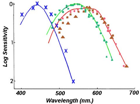
People with normal color vision are called "trichromats" because they require three primaries to match any arbitrary sample. The trichromatic eye has three cone types, each containing a photopigment which responds to a restricted range of wavelengths. The figure below shows the spectral sensitivity of each cone class. The long (red) and the middle (green) wavelength cones have very similar wavelength sensitivities, while the short (blue) wavelength cones shift well down the spectrum. Normal color vision is based on the ratio of activity in the three cones classes produced by a light of a given spectral distribution. The major color deficiencies are abnormalities in the way cone pigment is distributed in the cones. In all, there are three deficit classes.
Anomalous Trichromats
There is a subpopulation of trichromats, who still requires three primaries to match a sample, but whose matches are abnormal because they use one primary far more than would be expected. In reference to the figure, imagine one of the curves either shrunken in size and/or shifted laterally.
While having all three cone types, one cone type is rarer, has a reduced amount of pigment, or has a pigment tuned to an unusual wavelength. These "anomalous trichromats" fall into three groups, based on the primary which they overuse:
| Type | Cone | Male% | Female% |
| protoanomalous | "red" | 1.0 | .02 |
| deuteranomalous | "green" | 4.9 | .38 |
| tritananomalous | "blue" | ~0 | ~0 |
They can see all hue categories, so they are not color blind in any real sense. But they may have difficulty is discriminating colors which a normal would easily distinguish. Anomalous trichromats, however, are a very heterogeneous group. Some are only slightly different from normals, some are almost dichromats and others fall somewhere in between.
People with congenitally weak "blue" cone response, anomalous tritanopes, are virtually nonexistent. However, some eye diseases, such as glaucoma, attack blue cones creating "acquired" anomalous tritanopia. The loss of blue cones is usually greatest in the periphery.
Dichromats
The second class of color abnormal is the dichromat, a person who requires only two primaries to match any sample. These people are missing one of the three cones types shown in the figure.
| Type | Cone | Male% | Female% |
| protanope | "red" | 1.0 | .02 |
| deuteranope | "green" | 1.1 | .01 |
| tritanope | "blue" | .002 | .002 |
Unlike color anomalous individuals, dichromats are true color blinds in the sense that there are some hues which they cannot perceive. Lights which would appear different to a trichromatic eye are metamers (appear identical) if they create the same activation ratio in their remaining two cone classes. Protanopes and deuteranopes are red-green color blind and see only yellows and blues. The tritanope is analogously blue-yellow color blind.
However, there is evidence that at least some dichromats use rods to compensate for the lack of the third cone. Studies find that these dichromats can often discriminate colors along the red-green axis of color space.
Monochromats
Monochromats can match any light with a single primary. They generally have no cones and make all matches using rods. They are very rare, 1 in 10,000,000. With only a single receptor type, they can have no color vision and are truly color blind because they distinguish only brightness levels. Their vision is so generally poor that the color selection for visual design is the least of their problems.
Achromatopsia
Lastly, achromatopsia is a condition which arises from brain damage and not from cone abnormalities. These people see the world as having little or no saturation. Fortunately, the condition is very rare.
4.2 What do color blind people see?
Some theorists like to say things such as "a color which would look deep red to a normal, looks dark yellow or brown to a dichromat." This is speaking very loosely because it assumes a commonality of perceptual experience. Of course, it is impossible to know what color blind, or any other, people experience. Given this caveat, here is common lore.
Dichromats have a point on the spectrum called the "neutral point" where the light appears achromatic. The point is about the same for both classes, 495 nm. for protanopes and 500 nm. for deuteranopes, wavelengths which would appear slightly bluish green to a normal (assuming aperture color).
All wavelengths below the neutral point appear blue while those at longer wavelengths appear yellow. In the first few nm. away from the neutral point, apparent saturation increases rapidly, so dichromats can easily discriminate colors. The rest of the blues then appear similar as do the rest of the yellows and only discrimination of brightness is possible. Toward very long wavelengths, protanopes experience lights as becoming darker, so a very red apple, as already mentioned, might look dark yellow or brown. Some people think that a protanope sees red as black on a CRT because he has no "red cones." This is false because CRT colors always have white content and because "green" cones are still slightly sensitive to relatively long wavelengths. However, deep red may appear dark. Tritanopes have a neutral point at 570 nm., a wavelength which appears yellow to a normal trichromatic. Higher wavelengths appear red while lower ones appear green.
The description of dichromatic color perception comes from both theory and from studies of a few people who were dichromatic only in one eye. However, it"s not absolutely conclusive. First, there is no guarantee that the "normal" eye of a unilateral dichromatic is really normal. Second, studies often find that dichromatic color vision is much better than that predicted by theory. The best guess is that rods activate the red component of the red-green opponent process to give dichromats a weak three-dimensional color space.
4.3 What colors do the color blind confuse?
Anomalous trichromats are such a diverse group that they are difficult to characterize. Dichromatic confusions, on the other hand are more homogeneous and predictable.
A technical answer requires looking at cone activity. Recall that color is initially determined by the relative activity of the three cone classes. Protanopes, who are missing "red" cones, cannot distinguish lights which produce equal ratios of activity in the "green" and "blue" cones. Similarly, a deuteranope, who is missing "green" cones, cannot distinguish lights that produce identical activity ratio between the "red" and "blue" cones. Experts often plot these as "confusion lines" on a CIE diagram.
For a more qualitative understanding, look at the location of the protanopic and deuteranopic neutral points located at the edge of the green range. It should be clear that protanopes and deuteranopes will confuse reds-yellows-greens on the one hand and blues on the other. They have little ability to distinguish saturation except around the neutral point, so a deeply saturated blue and bluish white will appear similar in color.
On the other hand, they can generally discriminate differences between blue and yellow and blue and red. Besides this, dichromats use brightness to make most of their discriminations. Protanopes and deuteranopes, however, differ in the colors which they confuse and discriminate.
Likewise, tritanopes would have trouble discriminating hues located above or below their neutral points. Purples would also be difficult to discriminate since they differ in their blue content.
4.4 Can I simulate what dichromats see??
The qualitative description of color blind color confusions may be adequate for rough design guidelines, but the ideal solution would be to create a system which automatically changes display colors so that a normal trichromat could see what a dichromat sees. This is possible, but most people would find it difficult or impractical.
The obvious, but incorrect, solution is to look through colored filters that block part of the spectrum. Ideally, you could produce a protanopic view by looking through a filter which eliminated wavelengths that stimulate "red" cones" while allowing "green" cones to be normally stimulated. This won't work because the "red" and "green" cones overlap so greatly in their sensitivities to different wavelengths, that no filter can selectively block the wavelengths which activate one cone class and not the other.
The alternative is to create a simulation by mapping between CIE and RGB spaces. It is a fair amount of trouble and there still are several problems. For one thing, protanopes and deuteranopes differ in their color confusions, so you would need a simulation for each. For another, the CRT phosphors may be incapable of producing the right color. In addition, you would have to know the coordinates of phosphor that the viewer is seeing. If the display will be viewed on different monitors, then phosphor coordinates will vary and precise simulation is impossible. Lastly, if there are many colors, then computation can be expensive. Brettal et al. (1997), however, have an interesting computational alternative.
4.5 How should I design color for dichromats?
Dichromats are 1% of the population. Moreover, rod activation gives at least some dichromats the ability to perform some red-green color discrimination. In fact, studies find that dichromats generally use the same 11 basic color terms as trichromats.
If the designer wishes to take dichromats into account, the usual advice is to chose colors which differ greatly in brightness. This is called redundant coding - co-varying two or more perceptual dimensions so that a viewer can use either to perform the task.
Many advocate starting with black and white and then adding color after the design is complete. In this scheme, the designer substitutes chromatic colors with similar brightness to the achromatic colors in the image. The strategy for mapping from chromatic to achromatic colors can be based on the rough categorization into four brightness classes.
- Brightest: white, yellow
- Mid Bright: green, light gray, orange (yellowish)
- Mid dark: red, purple, orange (reddish)
- Darkest: black, blue
To ensure high brightness contrast, start with one of the brightest colors and one of the darkest. If the design requires only three colors, then add one of the mid colors. For four levels, supplement the base with one mid bright and one mid dark. Of course, this is sure to work only for the highly saturated colors. Desaturating colors in a CRT means adding white which makes them brighter. Finding three or four highly distinct brightness steps then becomes more complicated. Flicker photometry, anyone?
There are also several problems with the use of brightness as a redundant code.
- Brightness severely limits the number of categorical distinctions which the designer can code. While users can quickly distinguish the 11 basic color categories, brightness differences must be very large to be readily discriminable. Four levels would probably be the maximum.
- Using a redundant brightness code severely restricts color alternatives. Color is a very effective and powerful tool for creating usability, expressing meaning and providing aesthetic enjoyment. Ideally, it is best to give a designer as much freedom as possible in use of color. To compromise color use for the sake of 1% of the population may dearly penalize the other 99%.
There are many better choices besides brightness as a redundant code. For example, a color-shape code would make all objects which are round also red and others which are square always green. The viewer could interpret the display's code based on color or shape alone. Studies find that normals generally perform better with redundant codes, so they benefit. Dichromats could safely ignore color and respond to shape, so this approach does not penalize normal viewers while still providing cues for the dichromats. Stop signs are red and hexagonal, for example. Position is another option; traffic signals redundantly code color and vertical position. These redundancies obviously work, otherwise every intersection would be littered with wrecked cars belonging to dichromats.
Shape is usually the best choice as a redundant code if you are using color to show categorical distinctions. Shape does not constrain color choice because it is perceptually independent. It is easy to design in black/white and then add shape with assurance that there will be no perceptual integration. Unfortunately, shape, like brightness, does not permit a large number of categorical distinctions.
Moreover, shape is good at signaling same-different information because, like color, it is categorical; triangles and circles are related by a same-different relationship (nominal scale). Brightness is inherently a continuous quantitative scale which signals more-less relationships (ordinal and metric scales). Brightness distinctions are less noticeable unless the difference is very large. In sum, color and brightness scales are simply not a good mix since they have different perceptual properties. These issues are discussed more fully in Bertin"s Semiology of Graphics, a must read for anyone doing interface or information design.
If color is being used for emphasis, however, then size is a better redundant code than is shape. For grouping, use proximity as the redundant code. If color is used to convey meaning, then the meaning must be made redundantly explicit with an icon or text. Of course, small text and other fine detail require high achromatic difference for both dichromats and normals.
4.6 Can I test for color blindness on the Web?
Perhaps the best way to ensure usability for color blind viewers is to include some in the test population. This might seem obvious but there are several problems. First, there is the wide variety color of deficiencies. It"s probably best to ignore anomalous trichromats and concentrate on dichromats. Any color scheme that works for dichromats should be more than adequate for the less impaired anomalous trichromats.
Second, you need to test for dichromacy. Many people are unaware that they have any color deficiency or have no idea where they fall in the standard classification scheme. There are several websites with versions of the color blindness test, Ishihara Plates. However, testing on the web won"t work perfectly. Every CRT phosphor generates slightly different wavelengths and has slightly different gamma. Moreover, CRT phosphors are not perfectly uniform, so the same RGB value can produce different color and brightness at different locations. Lastly, ambient lighting variations can also affect the results.
4.7 Do the elderly see colors differently from the young?
Yes. In fact it is somewhat surprising that designers worry so much about color blindness, which is 1% (dichromatic) of the population, while they often ignore the much larger group of elderly, who almost always exhibit visual deficits. The elderly (65+) are 12% of the population and those just beginning to experience visual decline (50+) are 25%. Moreover, the elderly population is booming and expected to more than double in the next 30 years.
Vision declines with age in several ways, but the most relevant for color design is the yellowing and darkening of the lens and cornea and the shrinking pupil size. Yellowing selectively blocks short wavelength light, so blues look darker. Moreover, the elderly have difficulty discriminating colors which differ primarily in their blue content: blue-white, blue-gray, green-blue green, red-purple, etc.
Aging also reduces the amount of light reaching the photoreceptors compared to the young viewer. All colors will be dimmer and visual resolution lower. For example, a moderately bright yellow may appear brownish and dimmer blues will appear black. When designing for the elderly, use bright colors and make sure that brightness contrast is especially high (and text larger) to help compensate for acuity loss.
4.8 Can I simulate what the elderly see?
Yes, but only to a limited extent. The visual impairments of aging may have a neural component, but the major effect is optical. Unlike color blindness, a designer can simulate some aspects of visual aging by looking through filters. Simply obtain filters which add the right amount of yellowing and remove the right amount of brightness. The amount of light reaching the photoreceptors of a 60-year old is only 1/3 that of a 20-year old. By the mid-late 70"s, the light level falls to 1/8 that of a 20-year old. The color filtering is more difficult to specify, but picking any yellow filter will provide some idea of color change.
Other aspects of optical aging, however, are more difficult to simulate. The aging eye has a high degree of light scatter, development of micro-cataracts and a limited field of view. These can also be simulated optically but require much more effort.
Back to Top
A division of 2057949 Ontario, Inc.
Copyright © 2024 Marc Green, Ph. D.
Home Page
Contact Us
![]()
![]()
![]()
![]()
![]()
![]()
![]()