 .
.
Part 5: Using Color Effectively
Marc Green
5.1 What is color good for?
5.2 How does color convey meaning?
5.3 How can I use color to affect create depth?
5.4 How can I use color to change apparent size?
5.5 How do I use color to show similarities and differences?
5.6 How do I use color to organize the display into perceptual chunks?
5.7 How do I use colors to direct attention?
5.8 What are the alternatives to using color to direct attention?
5.9 How many colors should I use?
5.10 How do I use color to create emphasis?
5.11 How can I use color contrast to smooth aliasing?
5.12 How can I use color contrast to smooth animation?
5.13 How do I create an aesthetically pleasing color scheme?
5.14 What are some other aesthetic design hints?
5.15 What are some common mistakes in color usage?
5.1 What is color good for?
A designer should not use color without a specific plan or goal. Here are some of color's main uses:
- Conveying emotion and meaning;
- Changing perception of space;
- Changing apparent size;
- Showing similarities and differences;
- Parsing the visual field into chunks;
- Linking spatially separated objects together;
- Attracting attention;
- Creating emphasis;
- Smoothing to improve image quality; and
- Creating aesthetic and emotional appeal.
5.2 How does color convey meaning?
Color also conveys specific meaning such as warning (red), caution (yellow), safety (green), etc. There are some standards on the assignment of colors to meaning. OSHA (Occupational Safety and Health Agency), for example, has standardized:
- red: danger
- orange: warning
- yellow: caution
- blue: notice
- green: safety
Moreover, the CIE even specified the parts of color space which should be used for each color signal. However, these associations of color and meaning may be culture specific and should be used with care.
Various sources have suggested other standard meanings signaled by color:
- red: urgency, passion, heat, love, blood
- purple: wealth, royalty, sophistication, intelligence
- blue: truth, dignity, power, coolness, melancholy, heaviness
- black: death, rebellion, strength, evil
- white: purity, cleanliness, lightness, emptiness
- yellow: warmth, cowardice, brightness
- green: nature, health, cheerfulness, environment, money, vegetation
In addition, some quasi-standardized color meanings are emerging in the computer data entry fields:
- gray field: read only data
- white field: optional data entry field
- yellow field: required data entry field
- red field: error in field entry
Beyond specific color-meaning relationships, there are also some general interpretations. Cool and warm colors convey specific emotion to most viewers. A web site designer who wants to sell rock CD's to a young audience probably would prefer warm, high saturated, bright colors. A site selling to older more affluent buyers might prefer cooler, more sedate colors. In general, objects of similar hue form a common group while objects of different hue belong to different groupings. If the different hues are complementary colors, then the viewer will infer opposition.
Branding is another use of color to convey meaning. Businesses frequently try to differentiate themselves by creating a visually distinctive brand. One way to accomplish this goal is to create an association with a color(s) by means of a logo. IBM is blue, Fidelity is green, Coke is red and white, etc.
Lastly, be warned that use of color to convey meaning is very tricky. Of course, color-meaning connections do not always transfer across cultures, but there can be difficulties even within Western culture. Color meanings can conflict. For example, blue can mean power or melancholy, two ideas which don't seem compatible. Moreover, suppose there is a control colored red. Does that mean that something is wrong, so change the setting? Or does it mean don't touch the control and leave the setting alone?
5.3 How can I use color to create depth?
Among color's other properties, it can affect perception of 3D space. Mountains off in the distance usually appear blue-violet and indistinct. This effect, "aerial perspective," is a secondary consequence of short wavelength light's greater refractive index - it bends more. When white sunlight hits the atmosphere, the short wavelengths refract more, scattering into a bluey haze - hence a blue sky. In general, the farther light travels from an object to the eye, the more blue haze you see through and the less sharp the object appears.
The eye automatically interprets blue/violetness and loss of sharpness as signs of distance. Conversely, "warm" colors such as red, yellow and orange appear closer. A clever designer can use these color properties to add a 3D feeling to a flat display and enhance separation of foreground and background.
The foreground-background separation works best when foreground color is bright and highly saturated while the background is desaturated. In the figure below, notice how the text and rectangles seem to float above the background on the violet side but not on the red side. In fact, note how the entire red side appears to be covering the violet, so that the violet squares appear to be "holes" in the red which reveal the violet underneath.

5.4 How can I use color to change apparent size?
Brightly colored objects generally appear larger than dark ones of equal size. People will judge yellow larger than blue, for example.
5.5 How do I use color to show similarities and differences?
Hue is good for showing categorical (nominal scale) same-different distinctions. When viewing central category members, people naturally break the hues into categories which they quickly and easily judge as being the same or different. This makes color an ideal way to signal that objects have similar or different meaning, function, importance, etc.
On the other hand, hue is poor for showing quantity relationships, more/less, bigger/smaller, etc. because there is no natural ordering. Some advocate use of the "rainbow scale," red-orange-yellow-green-blue-violet, as a natural ordered representation with blue as less and red as more. People may have learned this order to an extent, but it is not a very powerful innate perception. If it works at all, it's probably because it approximates a brightness scale: blue is dark, green is middle brightness and yellow is high brightness.
However, you can create a very limited hue scale by starting at a central member and going to a border. For example, one end of the scale might start near unique green and the other blue-green. The amount of green then becomes a quantitative scale. Similarly, the scale might go from unique green to yellow-green. On the other hand, the scale should not span blue-green to yellow-green.
Although saturation can be an ordered scale, it has a drawback. Which end is less and which end is more? Most people probably take the highly saturated scale end to signify more and the white end as less, but this is not as strong a natural interpretation as some other scales possess.
There is usually a better solution for showing quantitative relations. Size, brightness, length and other variables which are naturally ordered "less to more" are better for representing quantitative differences (order and interval scales). Use only size and space to represent ratio scales.
5.6 How do I use color to organize the display into perceptual chunks?
A good design will use color to save the viewer from thinking too much. With several hundred million years of evolution behind us, color perception is deeply wired into our fabric. As a result, color perception is fast, accurate, automatic, and effortless. On the other hand, thinking is a relatively recent evolutionary advance, and we are not yet very good at it. By thinking, I mean reading text, attaching meaning to an icon, searching memory, etc. These activities are relatively slow, error-prone, require mental resources and effort and take learning. How many times have you misread a word? Probably often. How many times have you mistakenly seen blue as orange? Probably never, even if you are a dichromat. In sum, a designer should strive to capitalize on our hard-wired perceptual capabilities whenever possible.
The role that color plays in our normal behavior and interaction with the visual world is a complex topic, but I'll try to condense it into Reader's Digest form. It is first absolutely critical to know a bit about early vision and the distinction between "attentive" and "preattentive" processing. Everyone who creates graphics should understand this distinction since it is central to effective visual design.
When a viewer first looks at a scene, there is so much information that it cannot be digested (processed cognitively) as a whole. Instead, the eye's general strategy is to use a divide and conquer strategy - decompose the image into pieces that are examined one at a time. There are several problems here. How do you:
1. quickly and efficiently break the image into useful chunks?
2. isolate a single chunk from the rest for examination?
3. know which chunk to look at first?
4. know which chunk to look at next?
Let's start with the second problem. The answer is to use focused attention. It is often useful to think of attention as a spotlight which the viewer moves across the screen. In most cases, viewers shift attention by moving the eyes so that the area of interest forms an image on the fovea, the highest acuity area of the retina. Attentionally illuminated objects are then processed for meaning (what the text says, what the icons are suggesting, etc.) and are no longer simply patches of color. The viewer may be dimly aware of the sensations outside the spotlight (like the background buzz at a cocktail party) but has no idea of their meaning. This effectively concentrates processing on the local area, but still leaves a little room to be aware of the rest of the world.
Before attention can be applied, the visual system must solve problems 1 and 3. It attacks problem 1 through a preliminary operation called "preattentive processing," which occurs at the first moment a person sees an image or scene. It gets this name because the viewer has not yet focused attention to any particular location or object. At this stage, the viewer:
- takes in the entire field. The spotlight is not yet on.
- has not yet directed attention to any particular object
- has not yet processed anything for meaning.
- parses the field into segments and differentiates foreground from background. This must be done with raw sensory information, such as color, because there is not yet any meaning. This parsing sets the stage for the attentional processing stage.
This last point is of prime importance. By making different areas of the field different colors, the designer is telling the attentional system two things. First, the color layout indicates that parts of the image form distinct areas. Second, if the same color appears in different parts of the image, the designer is linking those areas together and saying that they have something in common.
Similar colors suggest a similarity relationship and different colors a difference relationship between objects and areas of the screen. It could be that names or icons representing all image files are red and while all text files are in green or that or last year's sales are blue and this year's sales are green. At first, the viewer won't know that colors refer to different files or sales classes, but s/he will automatically know that similar color represents similar type. The formation of the association through color is wired into us, so it is very fast, efficient and effortless. More importantly, it has no capacity limitation so we can see these relationships across the entire visual field at a glance.
Now let's suppose that the viewer focuses attention on some data on last year's sales (maybe graphs or tables, for example). S/he will be dimly aware that there are other blue areas on the screen. The viewer will be easily able to find all the other information about last year's sales; the eyes will make a fast movement called a saccade to another blue area. If there were no such coding, the user would have to scan each bit of information, examine it, perhaps read some text and then decide whether it were last year's sales. Using color short-cuts all this cognitive activity and allows the user to direct attention to other related and relevant parts of the field. Or perhaps, it is better to say that color allows people to ignore the irrelevant parts of the display.
Similarly, it is easy to find this year's sales figures because they are in green - no need to scan around and read labels. That is the flip side of color's power; objects of different color are automatically divided into different categories. It is very hard to attentionally group together objects of different color. Here's a simple example. Compare the effort required in reading the two words. Color variation makes grouping the letters into a readable word much more difficult.

Of course, the viewer might have to move attention through several green areas looking for a specific aspect of this year's sales, but the viewer still saves the trouble of scanning everything on the screen - s/he need only look at the green areas, a subset of colors.
But color is the proverbial two-edged sword because improper use can create havoc on display usability. Intermingling a large number of colors can confuse the preattentive parsing process and control of the attentional spotlight. Distinguishing foreground from background becomes difficult. The attentional system likes to jump from one foreground object to another. (This is why warm colors on a cold background are effective - it helps enhance foreground-background separation.)
Inconsistent use of color also confuses the system. Suppose that some of each year's sales were in blue and other parts in green. There would be no automatic grouping of similar types. In fact, this is worse than simply making both sales years the same color. Attention would have to work harder to break through the natural grouping which color produces.
5.7 How do I use colors to direct attention?
Now back to issue 1: where do I look first? If highly learned, a viewer may know where to look based on past experience. However, the designer can give the naïve and even experienced viewer a push in the right direction by clever use of color in preattentive processing.
Preattentive parsing tells the attentional system that there are different chunks of similar information. The previous section describes the user as first segmenting the image and then directing attention to one of the segments. However, a designer can use colors to automatically draw attention to a specific chunk, without needing to rely on the viewer to scan and move attention to the right location.
This is sometimes called the "pop out" effect, where a viewer examining an entire display has his/her attention automatically drawn to a particular area.
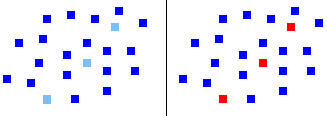
The picture below demonstrates both preattentive pop out and linking. Note that the red dots immediately pop out from the blue and that you can't help but link the red dots into a single line. On the left, the dots differ only by brightness, and the effect is not as strong. Moreover, look at the word "pop out" in the paragraph above. In your peripheral vision, the red still pops out while the brighter dots do not. This shows how the color difference can better guide attention to locations in the peripheral field, so you know where to look next.
This effect can be heightened by several factors:
- A smaller area of one color will stand out in a much larger uniform area of different color. The effect is best if the color is only used at that one location.
- Brighter colors will stand out from darker ones.
- Warm colors (closer) stand out more on a cool background (distance).
- Highly saturated colors are more noticeable than desaturated colors.
A clever designer can use these properties and automatically draw the user's eye to a desired location and control, to some extent, the movement of the eye around the image.
To learn more about the theory behind pop out, check out Green (1991), Green (1992) and Wang et al. (1994).
5.8 What are the alternatives to using color to direct attention?
Color isn't the only way to parse the visual field, show similarity and difference relationships, and direct attention, but it generally is the best. You could use text labels to show relationships, but the problem is that they would be hard to read because many would fall in the low acuity peripheral part of the visual field. Color discrimination vision does fall in the peripheral field, but very slowly compared to acuity. Moreover, text would have to be processed for meaning, which requires careful focused attention. Color perception, on the other hand, requires neither high acuity nor cognitive processing (such as reading), which is relatively slow and error prone.
With text eliminated, there are other perceptual dimensions which might be used in place of color. All can be used to group objects and locations in space, but each has a drawback when compared to color:
- Brightness or saturation. These are continuous scales having no discrete steps. Hue is a categorical scale, so it more directly and strongly signals similarities and differences.
- Size: Variation in size is also a continuous scale. Large sizes quickly consume available space.
- Shape: If distinctions are great enough, the visual system can group similarities and differences by shape. However, some shape discriminations, unlike color discrimination, fall rapidly in the peripheral field where acuity is low. Moreover, it is easy to create two highly distinguishable shapes but more difficult to create 3, 4 or 5, etc. which are easily and preatttentively distinguishable.
- Texture: A designer can also effectively signal similarities and differences with texture. Moreover, texture can also be used to create the feeling of depth to help differentiate foreground and background. It is limited, however, in two ways. First, like shape, it becomes difficult to create a large number of preattentively discriminable types. Second, textures may be hard to discriminate in the peripheral field if the elements are small.
- Animation and flicker. They have great power to attract attention and link objects in the field together (the "common fate" phenomenon). They can work well in small doses, but flickering or moving large display areas will quickly annoy almost everyone. Moreover, reading flickering or moving text is difficult.
- Highly familiar images. Although color pop out seems innate, similar effects occur with very highly learned images. The eye will be quickly drawn to very familiar logos, shapes, etc. This is one of the powers behind the concept of branding. Unfortunately, the designer must make assumptions about the user's familiarity with the image.
- Proximity: Often, the best alternative to color is to show similarity-difference relationships by spatial grouping. Locate similar objects in similar parts of the field. This has an advantage in that the eye need travel only short distances to move from one object to another. On the other hand, spatial location is not a categorical scale, so it may not always be as fast and efficient as color. The method also quickly eats up screen space.
Lastly, it may be advisable to use two or more dimensions simultaneously - redundant cues. As noted above, performance is often better and redundancy aids the color deficient.
5.9 How many colors should I use?
Since color is important for segmenting the image and for directing attention, overuse of color will confuse the user. Everyone says don't use too many different colors. Fine, but what exactly how many are "too many?"
There are a wide variety of estimates on the maximum number of colors. Common values include 4-6, 3-7 and 5-11. Derefeldt and Marmolin (1981) reported that the time required to search for information slowed after the use of 6 colors, but Smallman and Boynton (1990) found it possible to increase the number to nine colors, as long as they were widely separated in color space.
It's not clear, however, whether this advice is talking about hues, or combinations of hue and saturation. It is probably OK to use more colors if the design has desaturated colors.
Moreover, there are large numbers of situational factors. Do the guidelines depend on exactly what colors are used and how they relate? How about their spatial location? Does this include icons or just the client window of the screen? Does this include embedded natural images which can have thousands of colors or shadings which can have hundreds? Suppose a natural image has a few large color areas. Does this count against the number of colors available for other graphics? Obviously, a specific guideline doesn't help much since circumstances vary so greatly. However, it would probably be a mistake to exceed the 11 basic color categories if color is to code conceptual distinctions.
5.10 How do I use color to create emphasis?
One of color's main uses is to signal that some information is more important. The "pop out" effect described already will draw attention and create emphasis. More generally, emphasis is created by more: more size, more saturation, more brightness, etc. Of course, more is a relative term. A highly saturated object on a highly saturated background will not stand out as well as the same object on a neutral background. Lastly, using a light color on a blue background will cause figure-ground separation that emphasizes the foreground object.
5.11 How can I use color contrast to smooth aliasing?
Most of the time designers are trying to create sharp edges to promote legibility and perception of fine detail. But there are some instances where the goal is just the opposite - to smooth a digital image in order to hide aliasing artifacts.
A designer can use the lower spatial resolution of the chromatic system to decrease aliasing and improve image quality. The most common CRT resolutions create severe artifacts. For example, diagonal lines and edges suffer from a problem called "aliasing," or more descriptively, the "jaggies." Increasing resolution reduces the jaggies, but they are still visible even at the highest common resolution 1280x1024. The jaggies are an example of Vernier acuity, a hyperacuity which is one of our sharpest senses. In fact, it would require a resolution of about 4000x4000 to completely eliminate the jaggies at typical viewing distances. Such monitors exist, but they are far too expensive for typical applications.
The cheaper solution is to antialias the image. This reduces the jaggies by adding intermediate color/brightness pixels at judicious places on the line or edge. Antialiasing smooths the jaggies, but at a price: lines and edges appear thicker and slightly blurred. Moreover, antialiasing can take time and computer resources, so it slows rendering. Serious (and wealthy) antialiasers buy specialized hardware to reduce computational burden.
A designer can reduce jaggies by lowering brightness contrast, but then the line or edge then becomes less distinct. One solution is to reduce brightness contrast while simultaneously compensating with increased color contrast. This works because the jaggies are a fine detail, but the chromatic system has relatively poor spatial acuity and can't see the jaggies as well. Using colors with reduced brightness contrast and greater color contrast will retain line distinctiveness without the need to process and possibly distort the image.
5.12 How can I use color contrast to smooth animation?
The chromatic system has not only poor spatial resolution but very poor temporal resolution, a fact which can be put to good use in making animations appear smoother with fewer frames.
Animations create the sensation of motion by showing a succession of still images. Poor animation can create two artifacts, which may be reduced by substituting color contrast for brightness contrast:
- Flicker and jerky motion. High contrast achromatic borders make motion appearance jerky. Motion will appear smoother with low achromatic contrast, but of course this makes the moving objects less distinct. Again, the solution is to simultaneously reduce brightness contrast and increase color contrast. This effectively creates motion blur by taking advantage of the chromatic system's lower resolution. As with antialiasing, the substitution of chromatic contrast for brightness contrast "smooths" perception and greatly reduces flicker and jerkiness. (For anybody who cares,
the reason that fine detail causes jerkiness is that receptive fields that detect high spatial frequencies are small and undersampled unless the motion has very small steps. For gory details, see Green (1992a).
- Multiple images. Sometimes, as objects move rapidly across the screen, the viewer will see multiple versions of the image at neighboring spatial locations.
This occurs because the high spatial frequencies which see fine detail have longer visual persistence. The chromatic system's lower spatial resolution means that it not does see the culprit higher frequency components, so again, the designer can substitute color contrast for luminance contrast.
5.13 How do I create an aesthetically pleasing color scheme?
The designer should strive to create a display which is not only efficient from a human factors standpoint, but which also provides aesthetic satisfaction. It takes an expert to apply color in creating a very high quality image, but anyone can learn to use color to enhance aesthetic appeal. Besides, a designer often must rely on his/her own judgment because there is simply insufficient time or money to employ a real graphic designer.
Again, being introduced to a new field means learning the basic taxonomy. There are several types of color schemes. Some are simple while others are complex and should be left to the experts:
- Monotone achromatic: neutral colors only, white, black gray. Easy to use but requires expert care to avoid complete boredom.
- Monotone chromatic: a single chromatic color ranging in brightness and saturation: red, pink, rose, etc. Easy to use but again risks monotony.
- Analogous hues: two or three colors close to each other in color space: blue-greens, etc. Easy to use.
- Complementary hues: contrasting hues: blue-orange, red-green. Requires care since it can appear garish and unbusinesslike. Works best when the two differ significantly in brightness and one is relatively desaturated, , e.g., a dimmer, desaturated red and a brighter saturated green.
- Split complementary hues: uses three colors, one base color plus two, near, but not directly across, color space: orange with blue-greens. Works best when colors from opposite sides differ significantly in brightness and color(s) from one side is/are desaturated. Usually produces a less garish feeling than a simple complementary scheme.
- Triad hues: uses three hues approximately equidistant in color space: red-yellow-blue. Desaturate at least two hues. Triad schemes are often embedded in a generally neutral field, so it would work well on a typical Windows gray background.
- Tetrad color: uses 4 hues at equal intervals in color space: yellow-green-orange/red-blue/violet. Leave this to the experts.
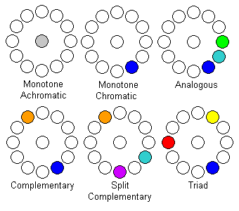
In general, the designer can achieve harmonious, balanced schemes by choosing colors which are neither too different (saturated red and green) or too similar (neighboring shades). Hue, saturation and brightness differences can all be used to modulate balance.
5.14 What are some other aesthetic design hints?
- Don't design one object at a time. For example, designing icons one at a time is a common mistake. Each icon has a different dominant color, so toolbars often look like an exploded rainbow. Instead, design color schemes - as described above - for sets of related icons, i. e., ones which control aspects of the same function. Remember that the eye automatically treats similar color objects as being of similar type. The schemes will make each set appear a harmonious unit internally and also help the user distinguish different sets. (Too often designers try to use shapes to differentiate icons. This generally fails, especially with buttons. Shape discrimination is less robust and is very poor in the periphery.)
- Don't make large areas highly saturated: It is a great temptation to overwhelm users with vivid color because of a high "wow effect" at first viewing. Over time, however, people generally find large saturated area tiring and annoying. To be satisfactory for long viewing periods, large areas or backgrounds should follow the "Johnny Carson" rule: be bland and restful with just enough verve to prevent total boredom.
- Don't make large equal-size areas with lots of contrast. For example, don't divide the screen in half with one side red and the other green or one side black and the other white. This is a common problem with web design when using frames of similar size. People usually find this annoying over time. Make areas unequal in size with the smaller more accented (brighter and/or more saturated.)
5.15 What are some common mistakes in color usage?
- Using insufficient brightness contrast. This is the biggest sin, by far.
- Paying attention only to aesthetics
- Using color for color's sake without a specific plan or color scheme
- Assigning different colors to the same type or the same color to different types
- Using hue to represent a quantitative continuum
- Creating large fields of saturated color
- Using too many colors
Back to Top
- Part 1: Basic Terms and Definitions
- Part 2: Color Discrimination
- Part 3: Color Appearance
- Part 4: Color Blindness
- Part 5: Using Color Effectively
- Part 6: Color for Text, Sign and Graph Legibility
- References
A division of 2057949 Ontario, Inc.
Copyright © 2024 Marc Green, Ph. D.
Home Page
Contact Us


Back to Top
A division of 2057949 Ontario, Inc.
Copyright © 2024 Marc Green, Ph. D.
Home Page
Contact Us
![]()
![]()
![]()
![]()
![]()
![]()
![]()