 .
.
Color Functionality in Tradedress: A Case Example
Marc Green
Color is far more than an aesthetic feature used in design. The choice of effective colors in visual communication is not arbitrary but is guided by innate human visual and cognitive mechanisms. For any given purpose, there is usually only a restricted set of colors that will achieve the desired goal. As a result, trademark and tradedress color(s) can be highly functional. Here, I describe an actual case that demonstrates the functional importance of color.
Facts Of The Case
One service station chain bought action against another for infringement of their tradedress. The senior company claimed that the junior had copied the appearance of their signs and of their station buildings. There were several aspects to the suit, including issues of name confusion, but I will discuss only the issues related to color.
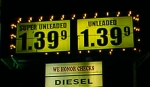 The color claim had two components. First, the senior company's "price monument" signs used black numerals on a yellow background. (The picture on the left shows a price monument with the color scheme in question, but it is not from either company in the case.) Second, their service station buildings employed red as the dominant color. The junior company also used black on yellow price monument signs and red as a dominant color in their service station design. The senior company claimed that this constitutes infringement because motorists would confuse the service stations due to their similar colors.
The Role of Color in Tradedress Functionality
Color can be function in several ways.
1. Visibility
Certain color combinations enable better detection, discrimination and recognition of objects and improved legibility of text. Brightness contrast, along with size and viewing distance, is the prime determinant of print legibility. High brightness contrast is created by some color combinations but not by others. It is not the colors per se that matter, but rather that different colors have different brightnesses. Black/white is the best combination because it provides the highest brightness contrast. There is also good apparent contrast for black/yellow, the color pair that has the next highest brightness difference. Research studies (e.g., Hackman, & Tinker, 1957; Tinker & Patterson, 1931) have confirmed this prediction by experimentally showing black/white and black/yellow produce the best legibility. Other color combinations produce lower brightness contrast and legibility, ranging from good (blue/white) to moderate (e .g., yellow/blue and red/white) to very poor (e/ g., yellow/white). In sum, although many color combinations might theoretically be used, the number that produce good legibility of print is small: black/white and black/yellow are best. Allowing the senior company to protect yellow/black would give them a functional advantage over all, except those using white/black. In sum, the high brightness contrast between black and yellow enables drivers to see the price information 1) at a greater distance, 2) with smaller sized numbers, 3) in peripheral vision, 4) under poorer weather conditions and 5) in spite of eye disease or visual loss due to aging. It also allows them to respond faster.
Further, contrast perception is affected by polarity, whether the contrast is light on dark or dark on light. "Positive contrast" is the case of a light object on a dark background, such as yellow print on a black field. Conversely, "negative contrast" occurs for a dark object on a bright background—black print on a light background, as in the price monuments. Although the physical contrast is equivalent in the two situations, the distinction is important because human sensitivity to negative contrast can be twice as great as for positive contrast. That is, both the yellow/black color pair and the exact rendering of the black letters on the yellow background used by the senior company were functional by increasing brightness contrast and hence legibility.
2. Conspicuity
A person to may fail to see even highly visible objects if they do not attract attention (Green, 2002a,b). Conspicuity attracts the spotlight and brings objects into conscious perception. Some colors attract attention better than others.
The issue of color conspicuity has been extensively studied because of its immense practical importance. In many safety-critical situations, it is vital that a viewer notice a sign or other object in order to avoid accident and injury. For commercial enterprises, conspicuity is an important tool to break through the clutter of signs and other objects and to engage the consumer. Conspicuity is therefore an important property of a price monument. If it is not seen, then it can't convey price information.
Words and numbers are not good conspicuity devices because reading text takes good acuity and mental effort. Since the fovea is small, conspicuous objects must be able to attract attention when see in low-resolution peripheral vision. Color can be an effective conspicuity device because it is easily and quickly perceived without the cognitive effort required in reading and can be perceived in peripheral as well as in central vision.
For many years red was considered the most conspicuous color. This belief was based more on intuition than on actual data. Recent research in commercial and safety fields has converged on the same conclusion: the most conspicuous colors are yellow and yellow-green, sometimes called "lime yellow." Here are just a few examples:
- A study found that yellow-green fire engines have far fewer accidents than red ones. The green-yellow engines are more conspicuous to motorists;
- A study of forestry worker clothing found that "lime-yellow" was the most detectable color and recommends its use for worker clothing;
- A large-scale study asked over 12,000 people to rate the "visibility" of a mannequin dressed in a variety of colors. Yellow was the clear winner. It also was chosen by 97% of 119 color deficient observers; and
- A marketing textbook contains a section on use of color to gain attention and says "Certain colors are inherently eye catching. Yellow is powerful because of its luminosity, and it is especially powerful when combined with black."
In sum, the use of yellow and black in the price monument is highly functional because it affords the optimal combination of visibility and conspicuity. Black/white has best visibility but low conspicuity. Moreover, the signs are normally seen against a blue background, the sky. Yellow is the color with the highest color contrast against blue backgrounds, providing better conspicuity.
3. Separating Foreground From Background.
When a person views a scene, s/he automatically decomposes the image into foreground and background. The foreground objects appear nearer and are more likely to be fixated and attended. Objects with "warm color," red, yellow and orange, are more likely to appear as foreground while blue is most likely to be seen as background. This means that a warm colored sign is desirable because it will appear as foreground against the sky. The use of yellow signs should then promote conspicuity and the perception that the sign is closer. (It is true that black is a dark color, but at a great distance, only the overall sign - the yellow part - will be visible.)
4. Meaningfulness & Association
Many colors convey a special meaning. These associations are regularly used in marketing and advertising to promote a product through the use of a positive association. Green packaging connotes organic, healthy and natural products because of the association with trees, grass, and nature. White signals purity and cleanliness while blue denotes cool. In short, the association of a color with a particular product class is not arbitrary.
Red is the ideal color for service stations. The mental associations for red are "hot", "fire" and "heat" (Birren, 1997; Mahnke and Mahnke, 1987). Red may have other associations, but the link between red and associations of fire, heat and energy are strong because there is a visual link between redness and the seen color of fire and very glowing hot objects. Red is therefore the ideal color for a business that wishes to use color as a means for signaling the sale of energy and heat producing products such as gas and oil. Looking at Birren's (1997) Chart II, in fact, there is no other color that creates appropriate associations.
Conclusion
Humans have evolved the ability to see color, not for aesthetic reasons, but as a functional ability to help us better perceive and understand the environment. Marketers and advertisers have been capitalizing on this fact for many years, so it is hardly surprising that color is often a highly functional property of a tradedress.
Here, I have demonstrated the importance of color in tradedress functionality in a particular case. The senior company used color combinations that promoted visibility, conspicuity, and recognition. Their color combination was optimal, but there were others (e .g., blue on yellow) that would also be reasonably effective. The number of functionally distinguishable "good" colors is very small, however, and allowing companies to protect them would quickly lead to color depletion.
Lastly, I have only discussed the functional properties inherent in color perception There are many aspects of visual perception which further affect functionality: size, shape, font style, etc.
References
Birren, F. (1997). The Power of Color. Citadel press: Toronto
Green, M. (2002a) Inattentional Blindness, Occupational Health & Safety Canada, Jan/Feb, 23-29.
Green, M. (2002b) The Science of Conspicuity," Brand Packaging, Jan, 38-42.
Hackman, R. and Tinker, M. (1957) Effect of variation in color of print and background upon eye movements in reading. American Journal of Optometry and Archives of the American Academy of Optometry, 34, 354-359
Mahnke, F. and Mahnke, R. (1987) Color and Light In Man Made Environments. Van Nostrand Reinhold: Agincourt, Ontario.
Tinker, M. and Patterson, D. (1931) Studies of typographical factors VII: Variation in color of print and background. Journal of Applied Psychology, 15, 72-78.
A division of 2057949 Ontario, Inc.
Copyright © 2024 Marc Green, Ph. D.
Home Page
Contact Us


A division of 2057949 Ontario, Inc.
Copyright © 2024 Marc Green, Ph. D.
Home Page
Contact Us
![]()
![]()
![]()
![]()
![]()
![]()
![]()