 .
.
SBFAQ Part 1: Basic Terms and Definitions
Marc Green
1.1 Why do I need to know about basic color perception?
1.2 What are "aperture" and "surface" color?
1.3 What is color?
1.4 How are lights and colors classified?
1.5 How many primaries are there?
1.6 What is the difference between luminance and brightness?
1.7 What is the difference between color and brightness contrast?
1.8 What are Trichromatic and Opponent Process Theory
1.9 What are The Basic Color Vision Tasks?
1.1 Why do I need to know about basic color perception?
"When you believe in things you don't understand, then you suffer."
-Noted philosopher Little Stevie Wonder.
Practitioners in any field can work in one of two ways, "cookbook science" or "explanatory science" (Gale, 1979). The "cookbook science" approach uses a set of rules, i.e., "IF this is true THEN do that." In cognitive circles, this is called "heuristic" or "shallow knowledge" because there is no deep understanding. The "explanatory science" approach uses "deep knowledge" or "first-principles." There is an understanding of "why" rather than merely an application of "that."
The cookbook science approach may suffice in the majority of routine problems. But it fails with more complex or extreme problems or when there is a shift in the context. For example, using bird migrations might provide a good rule for when to plant crops. It may work beautifully, so there is no need to understand weather patterns, soil conditions, etc. But if the birds changed their patterns, became extinct or if you moved to a different hemisphere, the rules would no longer work. If you understood about weather and soil, however, then you could still know when to plant.
Time and money constrain people working in applied fields, so many people prefer cookbook science. When encountering a problem, the optimal solution is a single number: neat, efficient and requiring a minimum amount of time to obtain and mental resource to apply. Many fields have books of tables and standards which a designer can directly apply to a wide variety of situations. Problem solved, now let's go on. There's no need to understand; just turn the cookbook to the right recipe.
When it comes to designing computer interfaces, information displays or other artifacts involving visual perception, this cookbook science "just give me one number" (or at least a simple IF-THEN rule) strategy is only partly successful. Most aspects of perception are highly dependent on context. In any given situation, there are many complex, interacting variables. Few numbers or guidelines hold true over many circumstances.
Of course, some guidelines are more robust. For example, monitor update
rate should be at least 60 Hz to avoid serious flicker. But even this
simple rule depends on the age and visual condition of the viewer, the
display's size, brightness, colors, phosphor decay characteristics, ambient
illumination plus a few more. Most problems are far more complex: How
many colors should there be in a computer interface? It depends on what
the colors are, how they relate, their location on the screen, the user's
goals, the user's eyesight and on, and on and on.
The designer must also frequently extrapolate and interpolate his/her
past experience as well as guidelines and rules. Not only do circumstances
and goals vary, but the rules change when faced with special needs groups
(color deficients, the elderly and the handicapped), a new technology
or a new medium. Moreover, blindly following ill-understood rules will
cause designers to misapply guidelines and make counterproductive choices.
For example, people frequently make incorrect assertions, such as "blue
is bad for text" because they are misapplying a rule from typography
to CRT screens. As I explain, this mistake would be obvious with a little
knowledge about chromatic aberration, contrast levels of CRT's and a magnifying
glass. In other cases, people waste time desperately seeking guidelines (what
color text is most readable?, etc.) in circumstances where the question
is simply irrelevant. People often ask the wrong questions because they
don't even understand the issues that are involved.
An alternative to finding a guideline is to pore through the library
stacks looking for research that can solve your problem. This can be extremely
time-consuming and the studies, if you ever find the right ones, are almost
certainly performed with equipment, methods, goals and/or users which
differ from those in your current situation. Do these the data generalize
to solve your problem? You need to evaluate the study, decide whether
it was properly performed and how to relate it your situation. A designer
cannot solve these problems without a good background in basic perception
so that s/he can interpret, extrapolate and interpolate as necessary.
More often than not, however, applied studies don't generalize well, so
all you have left to fall back on is either 1) trial and error or 2) a
good understanding of basic color vision.
Lastly, understanding basic color perception provides greater creative
freedom. If you want to manipulate color in predictable ways, then you
need to know what factors affect color discrimination and color appearance,
how various perceptual dimensions vary together, the effect of size and
spatial layout on color etc. Color is a tool and, like any tool, the more
you understand how it works, the better you will use it.
1.2 What are "aperture" and
"surface" color?
There are two worlds of color vision,
aperture and surface color. Although this distinction is important for understanding color
science, it is seldom made explicit. Beginners often become confused because experts use
different terminology and subtle variations in concepts when the context changes from one
world to the other.
The world of aperture color is about lights and wavelength. It is typically studied by
scientists examining the most basic aspects of color vision in the laboratory. In this
world, people view small, disembodied patches of color which are usually seen on a black
backdrop with no other objects visible. Moreover, observers are dark adapted, at a neutral
adaptation state, etc. to further remove extraneous factors. (Artists also have a similar
term, "local color," to denote color isolated from influences of background and
lighting.) Aperture color is good for isolating the effects of wavelength on color vision,
and explaining color matching and discrimination, the effect of light on cones, etc. But
it is not very good at predicting color appearance under more natural viewing
conditions.
The world of surface color is concerned with more typical viewing conditions. We
normally see colors as belonging to the surface of objects which are embedded in a scene
and viewed under some form of illumination. Under these conditions, backgrounds and other
objects in a scene can greatly influence perceived color. In fact, colors which appear
identical in aperture viewing can look very different in a scene and vice versa. To
understand color appearance in normal scenes, it is necessary to go beyond the world of
aperture color and wavelength into the more complex world of surface color. Here,
wavelength becomes only one of many factors which determine apparent color.
There is also a rough correlation between aperture and basic color vision on the
one hand and surface and applied color work on the other. People working in aperture
color are usually interested in fundamental limits and properties of human color vision.
The surface color world is often concerned with an applied problem where the medium
constrains human color vision potential. As a result, the answer to many questions, such
as the number of discriminable colors, etc., will differ depending on context. But if you
know the absolute limits of visual capability, then you can always at least make an
educated guess.
Unfortunately, even experts casually move back and forth between the two worlds when
discussing color. For example, in one breath someone might say that "lights of 580
nm. appear yellow" and in the next say "the background can change the apparent
color of an object." These statements would appear somewhat contradictory if you
didn't understand that the first statement referred to aperture color and the second to
surface color. Some other distinctions, notably lightness vs. brightness and saturation
vs. chroma, make more sense when viewed through the aperture-surface dichotomy.
Computer graphics, especially user interfaces, fall in the middle of these two worlds
because they are just patches of color rather than real world scenes or identifiable objects.
Still, backgrounds, illuminants, chromatic adaptation, etc. may be important.
1.3 What is color?
This is not
a simple question to answer. One common technical definition says that
color is any aspect of visual sensation that is not due to spatial or
temporal attributes of a light. This negative definition is
hardly satisfying and not very useful. It is on the right track, however, because no definition of color
should include the word "light," which refers to a portion of the electromagnetic
spectrum lying between 380 and 740 nm. Color is not a property of light
but rather of the brain/mind. After all, you don't need light to experience
color. You can see colors by closing your eyes and imagining a scene or,
if you are a masochist, hitting yourself on the head or pressing on your
eyeball. In any event, "color" is difficult to define in words because it is an experience
and experience is essentially nonverbal.
The more common
approach is to avoid a direct definition and say that color is a psychological
experience having three components, quality, quantity and purity. (Note
how this "definition" is really no better because it simply refers to
three experiences rather than to one.) However, the terms and concepts used
to define each of the three components vary somewhat with context. Most
notably, there are differences when dealing with aperture and surface
color.
In summary, two lights which differ on one or more of these 3 dimensions are said to differ in color. Although technical definitions always include brightness/lightness, even experts will often use the term "color" to refer to variations in hue and saturation/chroma alone. I will generally follow this convention but will note some exceptions. Lastly, I will attempt to avoid confusion by indiscriminately using the term "saturation" and "brightness" and will not distinguish between saturation/chroma and brightness/lightness in their strictest senses.
1.4 How are lights and colors classified?
In order to understand a topic, the first step is to study its taxonomy, the basic distinctions, and ontology, the common terms that practitioners use. Here are some distinctions and terminology helpful in understanding color science:
1.5 How many primaries are there?
It depends on what is meant by "primary color" because the definition varies with context. Here are 6 different ones:
- Color mixing primaries (3). A viewer can combine 3 specific primaries
in a comparison patch to make it appear identical in color to a sample.
In additive (light) mixing, the primaries are red, green and blue. In subtractive
(pigment) mixing, they are usually magenta, yellow and cyan (bright
blue). Printing also uses black ink, although it is not considered a
primary. Note that the color specification for primaries is vague -
red might be an additive primary, but there are many distinguishable
reds. Which red should you use? The answer is that any "good" red will
suffice, although the amount of each primary needed will vary depending
on the exact primaries used.
- Color matching primaries (many). There are again 3 primaries at any
given time, but in matching they can be any 3 highly saturated colors (Grassman's first law).
The only restriction is that two cannot be mixed to match the third,
i.e., there must be three degrees of freedom in the match. The difference
between mixing and matching is that in matching you are allowed to use
"negative" quantities of a primary. That is, you can add one of the primaries
to the sample. This creates a major practical problem in color specification.
- Notational system primaries (various): The Munsell system is a scheme
which originally used 5 primaries as a way of objectively representing
colors. The scheme is a notional system and, unlike the CIE diagram
and some other color spaces, is not meant to predict the outcome of
mixing colors. As a result, there is nothing special about having three
primaries.
- Mathematical primaries (3): Primaries may be mathematical constructs
that are neither physically realizable lights nor even perceptual experiences.
The CIE system employs 3 primaries which are imaginary, and are simply
numbers that the system uses. These mathematical "primaries" are not
realizable as real colors. The need for mathematical primaries arises in order to avoid the problem of negative light in color matching.
- Perceptual primaries (4): When speaking about color appearance, a primary is
a color which does not appear to be made of a mixture of other colors.
For example, purple appears to be red+blue and orange is red+yellow.
But red is simply red. By this criterion, there are four primaries:
red, blue, green and yellow. (There is some evidence that brown should be considered
a 5th primary.) These are the same primary colors found by Berlin and
Kay (1969) in their cross-cultural work. Moreover, the number 4 agrees well with Opponent Process Theory but not with Trichromatic Theory. Note how this conception
differs from the others: here primary refers to perceptual experience
and not to actual or imaginary lights.
- Focal primaries (6): Some people use the terms "focal colors" or "landmark colors" to signify the 4 perceptual primaries plus black and white. These are primaries in the sense that they are the fundamental colors of design and in Opponent Process Theory.
1.6 What is the difference between luminance and brightness?
The terms "luminance" and brightness" are often used interchangeably, although they have different meanings. Humans are more sensitive to light of some wavelengths (quanta of different energy) than others. Luminance is a physical measure which weights the effects of different wavelengths by human sensitivity. Brightness is a psychological experience. (The first rule of psychophysics is don't confuse physical variables with psychological ones!).
For any given color, a higher luminance will appear brighter. However, the relationship between luminance and brightness varies across colors, so two colors of identical luminance may not be equally bright. In daylight conditions, the brightest lights fall in the yellowish-green range. Blues, violets and reds are least bright. It is a common fallacy that blue is the brightest light at night. In dim illumination, viewers switch from cone (photopic) to rod (scotopic) vision, and sensitivity shifts to lower wavelengths. The brightest light changes to a less yellow green (the Purkinje Shift). Of course, at night you can't see chromatic colors, so the correct statement is that "at night the brightest light has a hue which would appear a green if viewed in photopic vision."
(An aside: It is also a common fallacy that individual rods are more sensitive than individual cones. Scotopic vision is more sensitive for other reasons. The major one is convergence, the number of receptors which feed each post receptor nerve cell. In scotopic vision, many rods converge on the postreceptor neurons. In photopic vision, the receptor-postreceptor convergence is as low as 1:1.)
The second major reason is the relative amounts of bleached and unbleached photopigment. In bright light, more of the pigment is bleached, so there is less to catch light quanta. In low light, there is more unbleached pigment ready for activation.)
1.7 What is the difference between color and brightness contrast?
One important distinction between sets of colors is whether they create brightness (achromatic) or color (chromatic) contrast. Both kinds of contrast make objects stand out from their backgrounds. However, there are significant differences in the properties of color and brightness contrast. A designer who understands these fundamental differences will find him/herself able to use color much more effectively.
The visual system has separate achromatic and chromatic subsystems for seeing brightness and chromatic contrast. The achromatic part has about five times better visual acuity than the chromatic system. (NTSC TV coding doesn't even bother transmitting the color of fine detail because the viewer wouldn't be able to resolve it anyway.) The higher the brightness contrast, the better the spatial resolution. If the viewer must resolve fine detail, as when reading small text, then there must be a high degree of brightness contrast and color contrast will matter little. A border that has chromatic contrast but no brightness contrast is "equiluminous" and appears blurred with a swimming and indistinct character.
The achromatic and chromatic systems also differ in their ability to perform temporal resolution. The achromatic system can follow much faster flicker and motion. As with spatial resolution, the more achromatic contrast the better the resolution. The chromatic system has a very sluggish temporal response. Rapidly alternating equiluminous colors produce very little flicker, for example. One way to see how much achromatic contrast two colors have is to rapidly alternate them and see how much flicker is produced ("flicker photometry"). As the achromatic contrast decreases to 0, the apparent flicker reaches a minimum.
In addition, people respond much faster to high brightness contrast than to color contrast. If reaction time is important, as in a warning or emergency situation, the signal should optimize brightness contrast.
In short, designers should not rely on chromatic contrast when the viewer must resolve fine spatial or temporal detail, as when reading small text or when detecting rapid blinking as a warning. Instead, design for high brightness contrast, with color choice secondary. As a general rule, the less fine detail to resolve, the lower the need for achromatic contrast and more freedom the designer has in choosing colors. On the other hand, there are times when the lower resolution of the chromatic system can actually be a help by reducing aliasing.
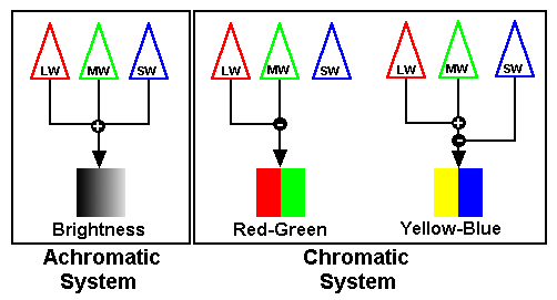
1.8 What are Trichromatic and Opponent Color Process Theories?
There are two major perceptual theories in color vision. Most people are familiar with Trichromatic Color theory, which posits the existence of three cone types. While Trichromatic Theory explains why 3 primaries are sufficient to match any sample, it cannot explain many other aspects of color vision. A second theory, Opponent Process Theory, is better at accounting for many color phenomena such as simultaneous color contrast, chromatic adaptation and complementary hues. Designers are less often knowledgeable about Opponent Process Theory, which is unfortunate because it is more directly related to the appearance of surface colors. Moreover, Opponent Process Theory has practical significance: many studies find that color manipulation through Opponent Process pairs is far more intuitive and easier than through the usual control of three RGB values or of X,Y, and Z CIE values.
The basic assumption of Opponent-Process Theory is that colors come in pairs. The "achromatic system" of black-white (brightness) and the "chromatic system" of red-green and blue-yellow. The achromatic system sees brightness contrast while the chromatic system sees color contrast. The picture below shows how the three classes of photoreceptor map on to the opponent process pairs.
Opponent Process Theory has been around 200 years, which is not surprising since the notion that colors come in pairs is based on some fairly simple observations:
- There is no such color as reddish-green or greenish-red. Yellowish-red,
yes. Bluish-red, yes. White (rose), yes. But close your eyes and
try hard as you might, it is impossible to imagine what reddish-green,
blackish-white or yellowish-blue would look like. Opponent-Process Theory
says that color appearance depends on the amount and polarity of each
process. The red and green are antagonists, so you can only see one
or the other at a time. (Obviously, you could have red and green lights
next to each other. It's just that they cannot appear at exactly the
same spatial location at exactly the same time.)
- Mixing red+green or blue+yellow produces a neutral result. It is as
if the red and green cancel each other, suggesting again that the processes
are actively fighting each other for control. Of course, the mix is
only absolutely neutral if the colors are exact complements. If not,
there will be a residual color signaled by the other color pair. For
example, mixing green and purple leaves blue. Purple is red+blue, so
the green cancels the red (actually magenta), leaving the blue signaled
by the blue-yellow opponent process.
- If you stare at a red light and then look at a neutral field, you
see a green afterimage. The logic is that the red and green process are in
constant conflict. When they are in balance, neither is dominant. However,
extended viewing of red fatigues the red process, so when you look at
the neutral field, the green process is stronger. That means that you
can create a green percept either by stimulating green or by weakening
red. Similarly, viewing green produces a red afterimage, yellow a blue
afterimage, blue a yellow afterimage, black a white afterimage and white
a black afterimage.
- In Opponent-Process Theory black is not the absence of light. Black
is a positive sensation that occurs when the black process is stimulated.
In fact, blind people, who presumably see no light, do not see black.
Instead, they perceive a color called "neural gray," which
is precisely what Opponent Process Theory predicts should occur if all
the opponent-processes were at their balance point.
Although Opponent Process is a very old theory, its physiological basis was discovered relatively recently. DeValois found neurons in the visual system which can be turned on or off by opponent colors. The actual behavior of the neurons is much more complicated than that of cones, so anyone trying to read about Opponent Process theory requires an understanding of advanced concepts like "receptive fields," etc. This likely explains the relative absence of Opponent Process Theory in popularized accounts of color vision.
1.9 What Are The Basic Color Vision Tasks?
It is important to distinguish among the different color tasks that a viewer might perform. I say this because the different tasks follow different rules and involve different parts of the visual system, e.g., photoreceptors, opponent processes and memory. Much like the case with aperture vs. surface color, experts often inadvertently confuse nonexperts by shifting gears from one context to another without making it clear that they are talking about a related, but different, phenomenon.
- Color discrimination: The determination of whether two colors are the same or different;
- Color appearance: The perception of colors. This is strictly internal to a viewer and cannot be directly measured. Color discrimination and appearance are only very loosely related tasks;
- Color naming: The task of putting a verbal label on the perceived color. There are many possible colors but only a few common color terms. In other words, many colors will have the same name. But how do people chose which name to use?; and
- Color memory: If the two colors are not simultaneously present, the viewer must recall color. This is limited largely by memory and by color naming.
- Part 1: Basic Terms and Definitions
- Part 2: Color Discrimination
- Part 3: Color Appearance
- Part 4: Color Blindness
- Part 5: Using Color Effectively
- Part 6: Color for Text, Sign and Graph Legibility
- References
Back to Top
A division of 2057949 Ontario, Inc.
Copyright © 2024 Marc Green, Ph. D.
Home Page
Contact Us
![]()
![]()
![]()
![]()
![]()
![]()
![]()